Addressing the mental health of pregnant women
This healthcare app is designed for pregnant women and new moms dealing with depression. It offers activities to promote positive thinking and relaxation, as well as a feature to manage schedules and medication intake. Overall, it's an essential tool for supporting mental and emotional well-being during this challenging time.
My role: UX Researcher and Designer
Time frame: 2 weeks (Feb 12- 26/2023)
Tools: Figma, FigJam, Paper and pencil, Slack, Zoom meeting
Problem space
Young pregnant women are affected or struggling because of mental health and not getting attention or treatment as needed
Major Problems:
High blood pressure
Infections
Depression and anxiety
pregnancy loss preterm labor
Key research insight
Major depressive episodes during pregnancy and the year after birth, known as the perinatal period, are common, affecting up to 1 in 5 U.S. women. More than half of these women go undiagnosed and 85% are untreated, which can lead to complications during pregnancy and childbirth. In the most severe cases, perinatal depression can increase the risk for a mother to end her own life or that of her child.
In 2018, nearly one in 10 women who delivered a baby was diagnosed with postpartum depression (PPD).
Assumptions
I assume pregnant women would like to connect with other women on the same journey other than their partners.
I assume not getting payment plans and affordable healthcare is holding them back from contacting health support.
I assume pregnant women couldn't schedule appointments easily at the right time.
i assume that women want to connect with other people on the internet.
I assume pregnant women don’t know how they should spend their time.
i assume women who are pregnant dont know how to spend their time.
Interview
To validate my assumptions and ensure their accuracy, I implemented a research plan that included conducting interviews with 4 potential users. As a starting point for these interviews, I developed a hypothesis based on my initial assumptions.
After interviewing 4 people I analyzed and synthesized the data gathered. This includes identifying common themes, patterns, and insights that emerge from the interviews and organizing and categorizing the data meaningfully.
Key theme 1
Phone
in person
Need for support and guidance
As most of my interviewees, they need help from experienced individuals, such as friends who have gone through the pregnancy journey, as well as healthcare providers.
Methadology
20 min
Pregnant or new mom
Key theme 2
Desire for more communication
Most of the interviewee said that communicating with healthcare providers and scheduling appointments is much needed.
Key theme 3
Engage in self-care activities
Such exercise and relaxing activities like taking a shower or practicing yoga, as well as reaching out to friends for support, helps me to understand that engaging in self-care activities is one thing.
Persona
How might we
Following an in-depth analysis of the key themes and challenges I identified the critical pain points and crafted the following How Might We statement as a guiding principle to design an effective solution.
"How might we provide support to pregnant women experiencing depression?"
Task selection
After creating a persona I wrote 20+ user stories to have an idea of what I should be focusing more on when designing the app. From all these user stories I picked my core epic related to my persona. Decided to focus more on budgeting for their trip.
Core epic
As a Young pregnant woman, I want to work out a routine that I follow every day so I can feel better both physically and mentally
Task flow
To better understand the user journey, I created a task flow that outlined each step a user would take to complete a specific task.
sketches
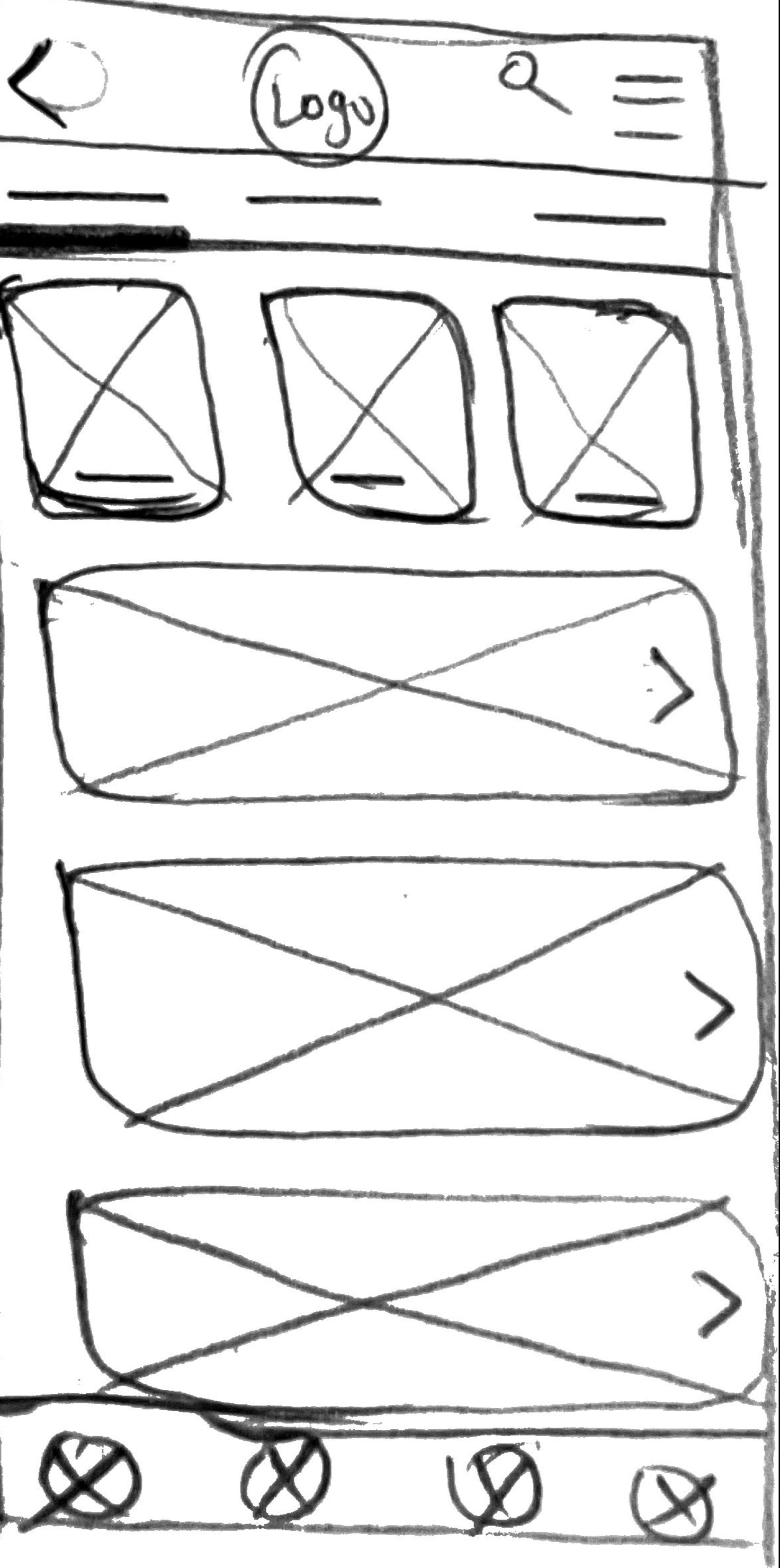
To ensure that my wireframes would effectively address the problem space, I first created an inspiration board to gather ideas and insights from other successful designs and sketch some ideas I thought could help me solve the problem. This included workout apps, healthcare apps…
Why i chose the sketches
The chosen sketch presents a login screen that is designed to create a calm and engaging user experience. The interface has been designed to ensure that users are able to easily navigate and understand the login process, which is an important element in creating a positive user experience.
Login screen sketches
Chosen sketch
Lo-Fi
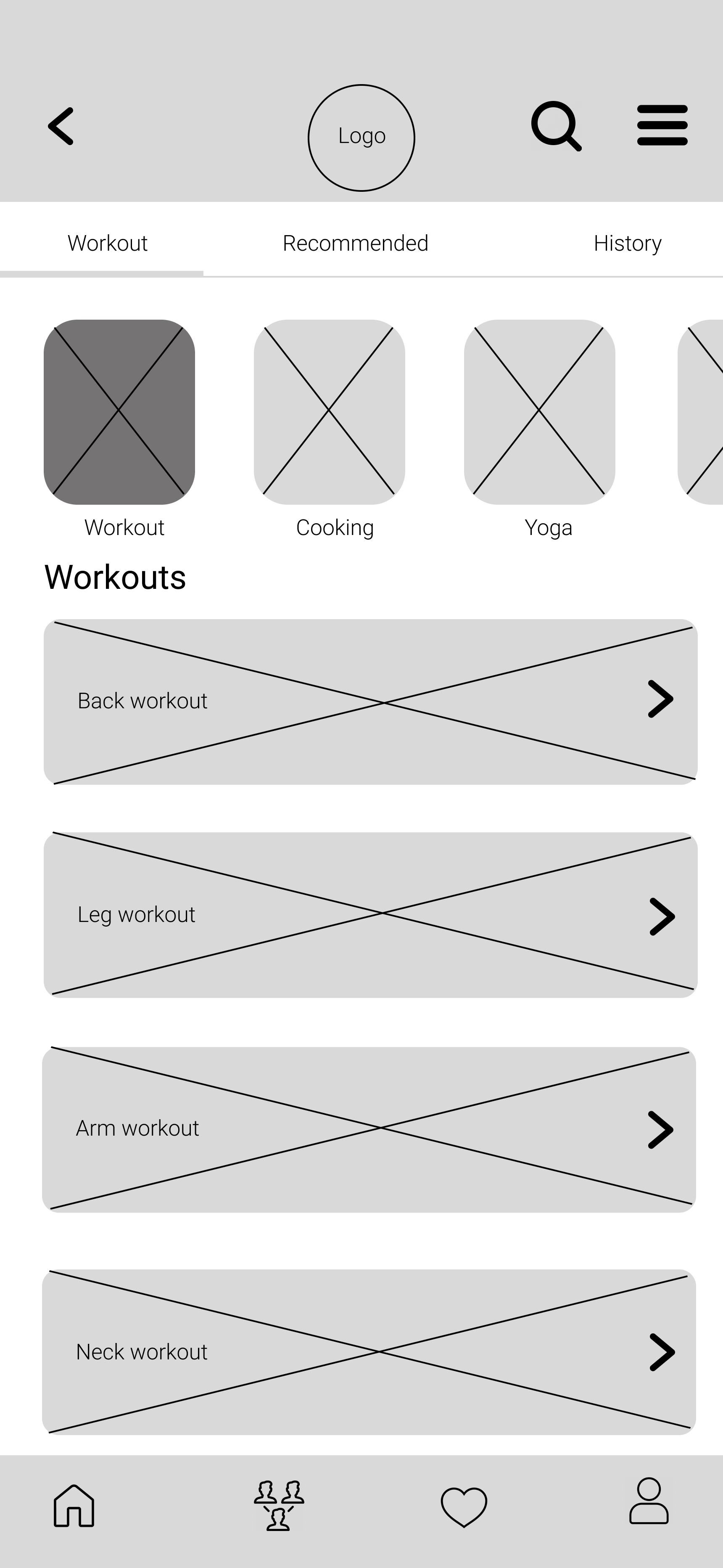
Work out list screen
Chosen sketch
Lo-Fi
Home screen sketches
Chosen sketch
Lo-Fi
Recommended screen
I created this screen based on the sketches I have done for the previous sketches.
Lo-Fi
Chosen sketch
Wire frames
User testing
To ensure the user-friendliness of my design, I conducted two rounds of usability testing with a diverse group of five participants, selected based on their alignment with the targeted user persona and the task flow defined in the project scope.
28 years old
Lenna
Clifton, NJ
26 years old
James
Washington, DC
Daniel
24 years old
Silver Spring, MD
Kyle
30 years old
Denver, Colorado
Sara
26 years old
Denver, Colorado
V1-V2
V1
Following the user testing, I received a lot of feedback and used it to make several changes. The goal was to create a more user-friendly and clear product that could effectively solve the problem at hand.
Home screen
V2
It shows that it is clickable and there are more on the schedule.
The title drags attention. so that users check their schedules before proceeding to anything.
More detail and instruction on what they should be expecting next
More organized
Texts are loud and clear
V1
Workout screen
V2
Not too much going on.
The user's attention will not be dragged by extra things.
It indicates where exactly the user is.
V1
Recommended screen
V2
easy way to add the workout to favorites
An easy way for users to see the details of each workouts
Final Lo-Fidelity
Final Lo-Fidelity
What is next
Create a digital color and typeface library
Start working on the hi-fi version of the app
User testing modifies the hi-fi


